

Connecting Millions Across the Globe
In 2016, Tinder acquired the Humin team and IP, bringing me onboard full-time as a joint Interface Designer and Product Manager. Over 4 years, I led production of multiple full-stack pods across the revenue, growth, product innovation, and partnership verticals.
TINDER GOLD
“See who likes you before you swipe.” It was a simple premise that offered online daters a true super power: the ability to sort everyone nearby by who was attracted to them. This would be the flagship feature within a new premium monthly subscription tier, Tinder Gold.


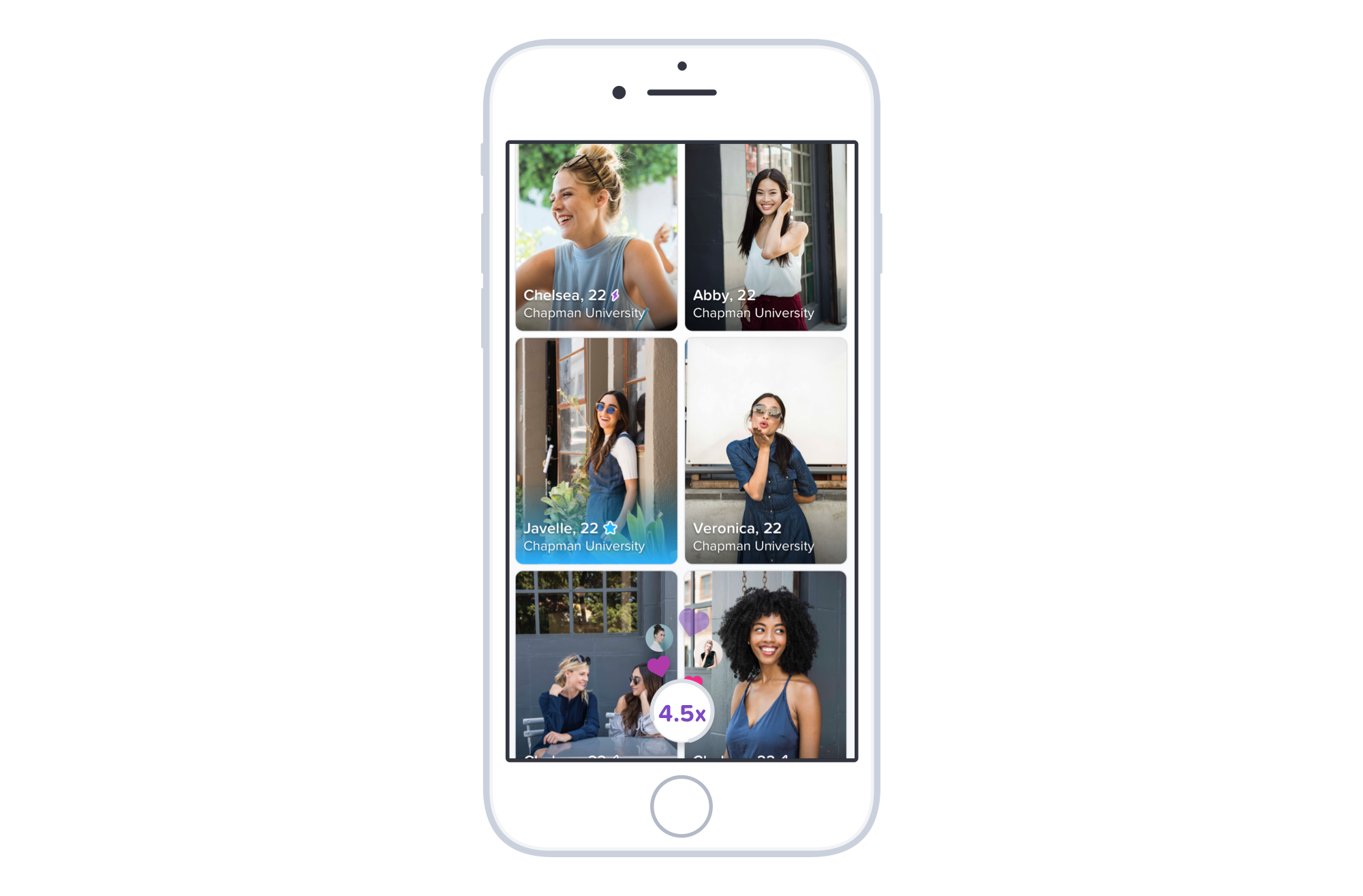

With the “Likes You” feature, members can match when they’re ready. The grid view of people who have already “Liked” them lets subscribers view all of their options and start conversations at their own pace. Want more likes? Activating the purple “Boost” button at the bottom of the screen promotes the user’s profile to the front of the line in their area for 30 minutes, adding up to 10x more new likes in a quick burst.
TINDER GOLD BRANDING
The new Tinder Gold subscription package launched as part of a tiered offering, and included all of the features of the existing Tinder+ tier in addition to the flagship feature, “Likes You.”
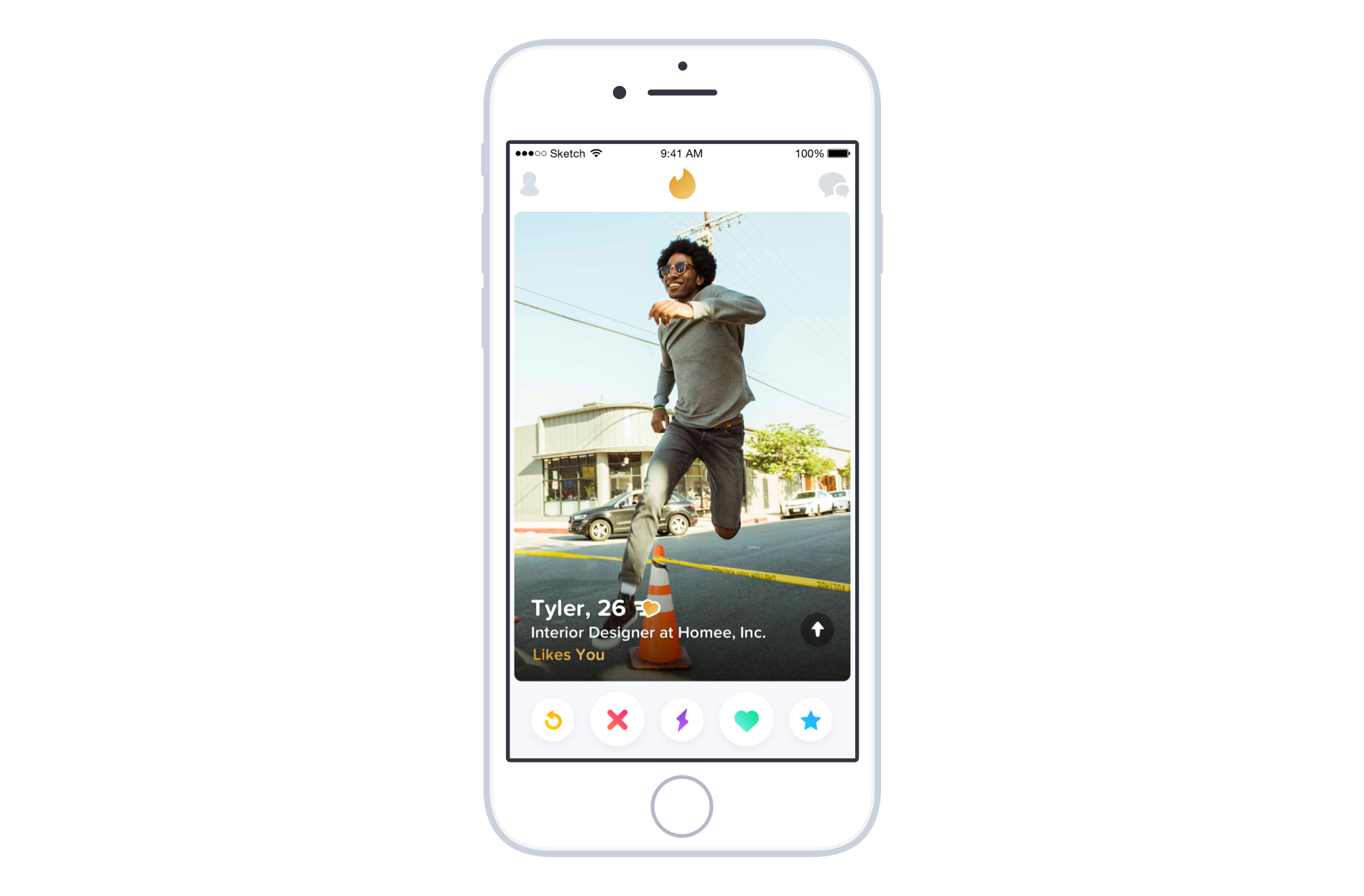
In order to sell a premium subscription, we needed to create a premium experience. When members subscribe to Tinder Gold, the product branding and color scheme is transformed. Users immediately feel the difference after signup and lapse.
The gold interface is not just a static gradient; the shine is controlled by the phone’s gyroscope, a detail that makes our subscription entry points more distinct.


INTERACTIVE PROFILE CARDS
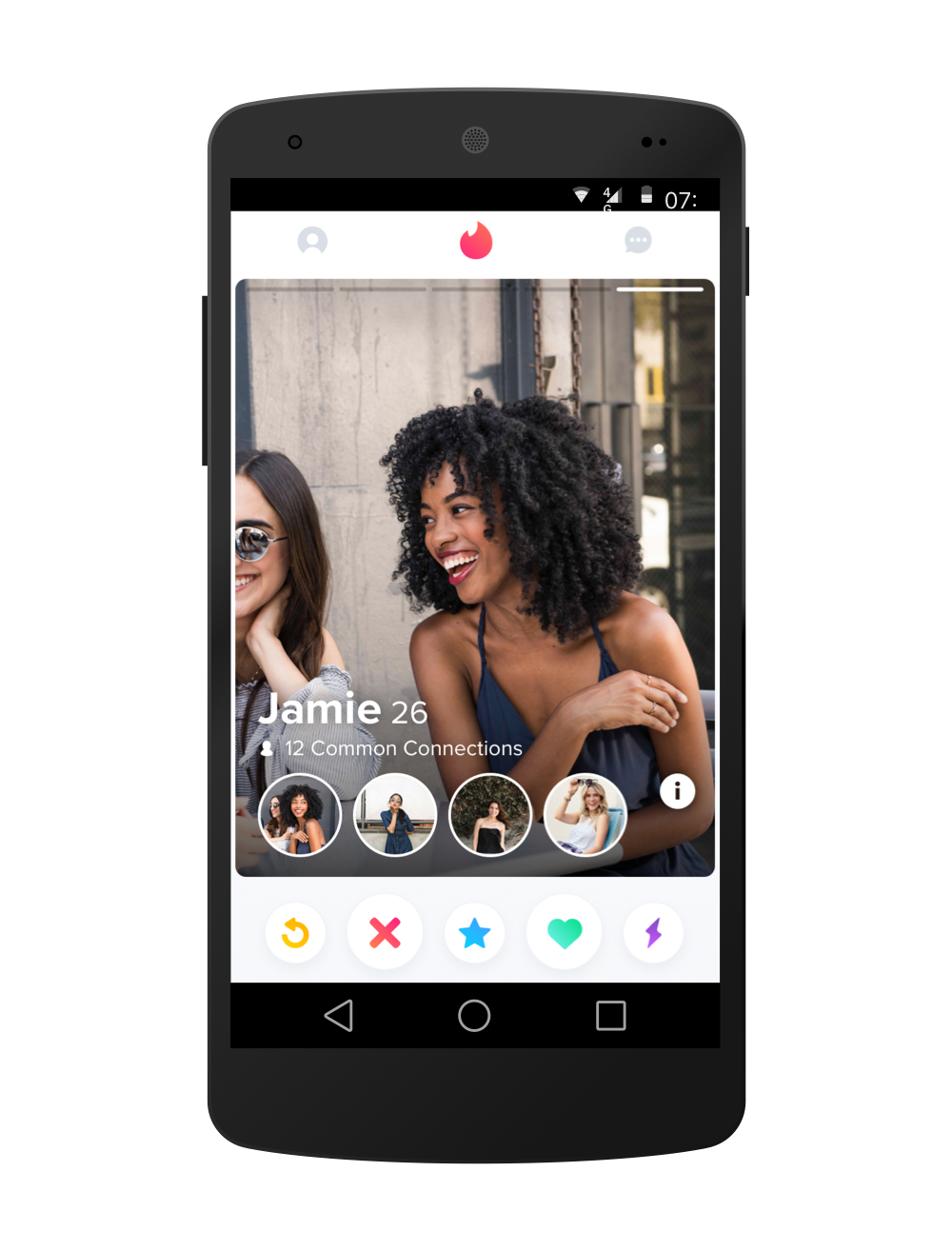
On Tinder, online dating profiles have a very brief opportunity to pique someone’s interest. Tinder users will swipe hundreds of times per day, but judging potential partners by only their first photo. Profile photos are the most important content for determining attraction, but internal experiments revealed that bios, musical interests, education, work, and non-visual content also helped convert “No’s” into “Yeses” and “Yeses” into “Super-Likes” (in-app purchases).
In 2016, profile cards on Tinder only showed the candidate’s name and photo, requiring users to tap into profiles to see more. Instead of trying to drive users to open more profiles, I designed and prototyped an interface that balanced visual and verbal profile content on the front of the card. This new interactive profile experience led to deeper profile engagement, more matches, and greater user retention. The project also catalyzed a transition in internal success metrics; we shifted focus from volume metrics (swipe right volume, match volume) to efficiency metrics (swipe right rate, matches rate), transforming our roadmap and objectives.
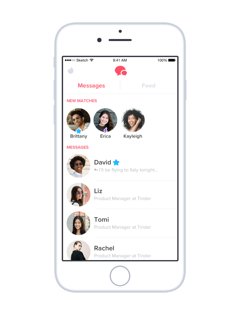


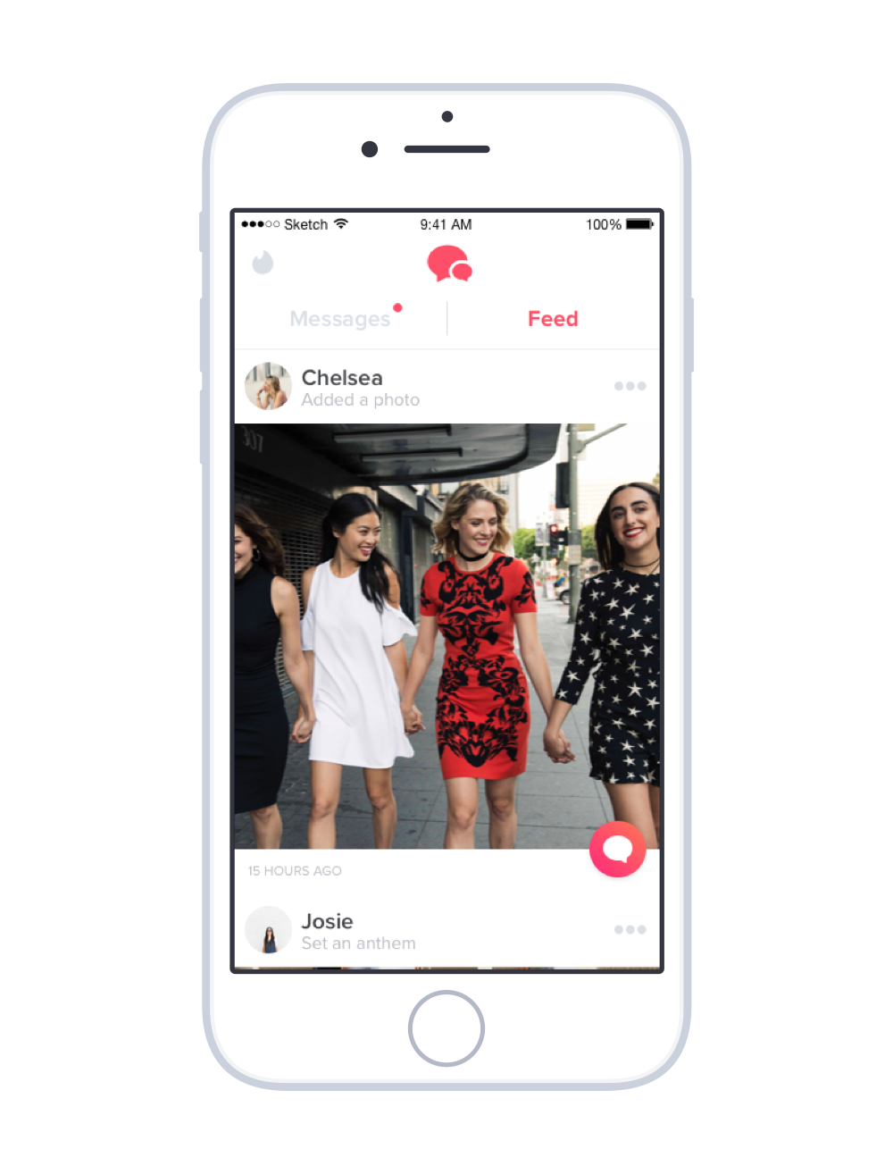
ACTIVITY FEED
Flirting is hard. Flirting over text messages with someone you’ve never met can be excruciating.
The window of opportunity to start a conversation in Tinder is very brief. Within a day of matching with someone on the dating platform, the conversation probability drops to 50%. By the end of a week, that probability is in single digits. We knew that if we could extend the shelf life of a match, we could unlock a lot of value for members.
Looking to other social platforms, it became obvious that messaging about content is much easier than sending a message out of the blue. A post is an invitation to chat, no matter how long it’s been since you last spoke.
I led design and product management for the Activity Feed, a new tab with the latest profile updates from your matches. The feature meaningfully improved conversation rates and also built a competitive advantage over dating platforms that expire new matches after 24 hours without messages.

SPOTIFY x TINDER
In the Summer of 2016, Tinder profiles were relatively lifeless. The majority of users had fewer than 3 photos, no bio, and very little content that potential suitors could use to identify mutual interests.
The team was looking for tools that people could use with minimum effort to better express themselves. I led the business partnership with the social music streaming service Spotify to bring musical interests into users’ profiles.
Authenticity is important to the Tinder experience. Instead of allowing users to curate a playlist that describes their musical taste, we opted for an automatically-generated “My Top Spotify Artists” queue. By authorizing Spotify within the Tinder app, users’ profiles would show their current top played artists. As a bonus feature, any user (whether/not they use Spotify) could add a song or “Anthem” to their dating profile without connecting Spotify.
The partnership and integration continues to this day, and profile Anthem updates are the #1 generator of conversations between matches in the “Activity Feed” experience highlighted above.
COMMUNITIES
Coming Soon
